How to Choose the Perfect Color for Your Accent Wall
- By the dedicated team of editors and writers at Newsletter Station.
An accent wall is one of the simplest yet most transformative ways to refresh your space without a complete renovation. Whether you want to make a bold statement or subtly define a room, the right accent wall color can add depth, contrast, and personality.
But with countless shades and finishes available, choosing the perfect color can feel overwhelming. This guide will walk you through what to consider—from the room’s purpose to lighting and décor—so you can confidently create a space that feels cohesive and inspiring.
Consider the Room’s Purpose and Mood
Every room in your home serves a unique purpose, and color has a powerful influence on how it feels. Start by thinking about the mood you want to create: cozy, relaxing, energizing, or sophisticated.
Here’s how to choose colors that align with the room’s function:
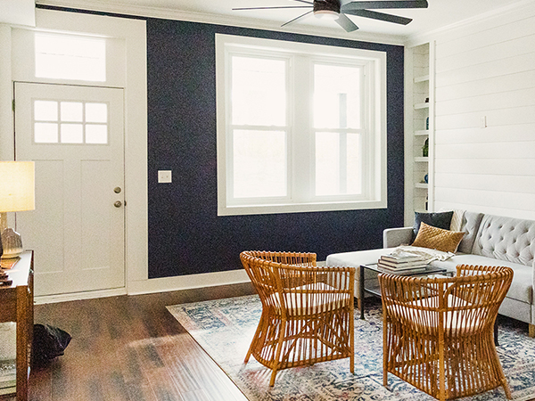
Living Room: For warmth and connection, try rich earth tones like terracotta, caramel, or olive green. If you prefer a more modern or calming vibe, consider cool navy or charcoal gray.
Bedroom: Soft, muted hues such as powder blue, sage, or lavender promote rest. For a bolder, dramatic effect, try deep plum or charcoal with metallic accents.
Kitchen: Energize your space with bright yellows or fresh teals, or keep it timeless with soft neutrals like warm gray or creamy white.
Home Office: Choose shades that encourage focus and creativity—greens, soft blues, or warm neutrals work well. Avoid overly bright colors that might feel distracting.
Dining Room: Deep reds, forest greens, or moody blues create an intimate, elegant setting perfect for entertaining.
By aligning color psychology with the room’s purpose, your accent wall can enhance both style and function.
Coordinate with Existing Décor
Your accent wall should harmonize with your furniture, flooring, and overall color scheme—not compete with them.
If your room features neutral décor, feel free to experiment with bold hues like emerald green, navy blue, or even burnt orange for a striking focal point.
If your space already includes vibrant furniture or patterns, opt for a more subtle accent—perhaps a soft beige, blush, or dusty blue—to maintain visual balance.
Consider your metal finishes (gold, chrome, black) when selecting undertones. For instance, warm metals pair beautifully with rich, earthy shades, while cooler metals work best with grays and blues.
Consistency across textures and tones helps tie the entire room together for a cohesive look.
Test Paint Samples in Different Lighting
Lighting can completely transform how a color appears. A shade that looks perfect in daylight may appear darker or warmer under artificial lighting.
Before painting the entire wall, test the paint on a sample directly on the surface. Paint two or three swatches side by side and observe them throughout the day. Notice how the color shifts in natural morning light versus evening lamplight.
Pro Tip: Use adhesive paint sample sheets for easy removal and comparison—ideal if you’re choosing between multiple shades.
Understand How Color Affects Space
Color influences perception of size and depth.
Lighter colors open up smaller rooms, making them feel airy and spacious.
Darker colors create coziness and intimacy, ideal for larger rooms or spaces where you want to add drama.
For a balanced effect, choose an accent wall opposite a window or main entryway—this helps draw the eye naturally and enhances depth without overwhelming the room.
Maintain Balance and Flow
An accent wall should enhance, not dominate. Choose a wall that already serves as a visual anchor—behind a bed, sofa, or fireplace, for example. Avoid walls cluttered with windows or doors, as the architectural breaks can interrupt the color’s impact.
Use décor—like artwork, mirrors, or plants—to echo the accent color elsewhere in the room, creating flow and unity. Subtle color repetition ties the design together effortlessly.
Don’t Forget About Finish and Texture
The finish you choose can dramatically change the final look.
Matte finishes are great for hiding imperfections and giving a soft, modern appearance.
Satin or eggshell finishes reflect light gently and are easy to clean—ideal for high-traffic areas.
Textured finishes like limewash, wallpaper, or decorative panels can add visual depth and dimension without additional color contrast.
Experimenting with finishes allows you to express creativity while maintaining a polished, professional look.
Choosing the right accent wall color is both an art and a science. By considering the room’s purpose, existing décor, lighting, and layout, you can confidently select a color that complements your home’s style and enhances its atmosphere.
Remember—paint isn’t permanent. Don’t be afraid to experiment with samples, finishes, or even wallpaper textures until you find the perfect match. With a thoughtful approach, your accent wall will become a stunning focal point that adds warmth, balance, and personality to any room.