- By the dedicated team of editors and writers at Newsletter Station.
Color plays an essential role in how a space feels, functions, and expresses your unique style. Whether you’re updating your home, completing a DIY project, or working on a creative design, choosing the right paint color can be surprisingly challenging. What you imagine doesn’t always translate the same way once it’s on the Wall—but with the right approach, color matching becomes much easier.
Below are practical, updated strategies to help you confidently match paint colors and achieve the aesthetic you’re aiming for.
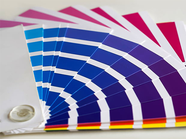
Use Paint Swatches or Chips
Most paint retailers offer swatches or chips you can bring home to compare in your own environment. Tape multiple options to your walls and observe them throughout the day. Lighting shifts dramatically from morning sun to evening lamps, making swatches a valuable first step in identifying what complements your space.
Understand Undertones
Many colors carry subtle undertones that influence how they look in different settings. For example, gray may lean blue, purple, or green depending on the formula. Recognizing these undertones helps ensure the color aligns with your décor, flooring, and overall design plans.
Paint Samples Directly on the Wall
Once you’ve narrowed your favorites, purchase small sample containers. Paint a medium-sized test patch—about 2'×2'—to see the true effect on your Wall’s texture and lighting. This method offers the most accurate preview before committing to a full gallon.
Compare Lighting Conditions
Natural light, LED bulbs, warm incandescent light, and cool fluorescent light all influence how a color appears. A shade that looks bright and crisp during the day might appear muted at night. Test samples under various lighting conditions to ensure the color remains appealing around the clock.
Consider the Purpose of the Room
Think about how you want the space to feel. Calming tones, such as soft blues and muted greens, work well in bedrooms or spa-like bathrooms. Energizing shades like yellows and oranges, and bold accent colors, are better suited for kitchens, offices, or creative spaces. Aligning your color with the room’s purpose enhances both mood and functionality.
Use a Color Wheel for Guidance
A color wheel remains one of the most helpful tools for understanding color harmony. Whether you're looking for contrast, balance, or flow, using complementary, analogous, or triadic combinations can help create a cohesive, professionally designed look.
Try Digital Tools and Apps
Modern color-matching apps can scan photos, analyze colors, or generate ready-made palettes. These digital tools are handy if you’re trying to match a hue from furniture, artwork, or décor—making inspiration easy to turn into reality.
Ask a Professional for Advice
Interior designers and color consultants can simplify the decision-making process with expert insights. They consider factors like lighting, existing finishes, layout, and long-term style goals to help you choose colors that will stand the test of time.
Test the Paint Finish
Finish affects both appearance and durability. Matte hides imperfections, satin offers a soft sheen, eggshell works well in living areas, and gloss provides shine and easy cleaning. Always test your chosen color in the finish you plan to use, as sheen can slightly shift the perception of the hue.
Take Your Time
Patience is key to getting the color right. Give yourself time to view samples at different times of day, compare undertones, and evaluate how the color fits your design vision. Rushing the process may lead to frustration—or expensive repainting.
Matching paint colors may take some time and experimentation, but the right approach makes the process enjoyable and rewarding. With thoughtful testing, helpful tools, and a clear sense of your design goals, you can confidently choose a color that enhances your space and reflects your personal style.