
FEATURE ARTICLE
How Color Palettes Influence the Mood of Your Home Interior
Jun 24, 2026
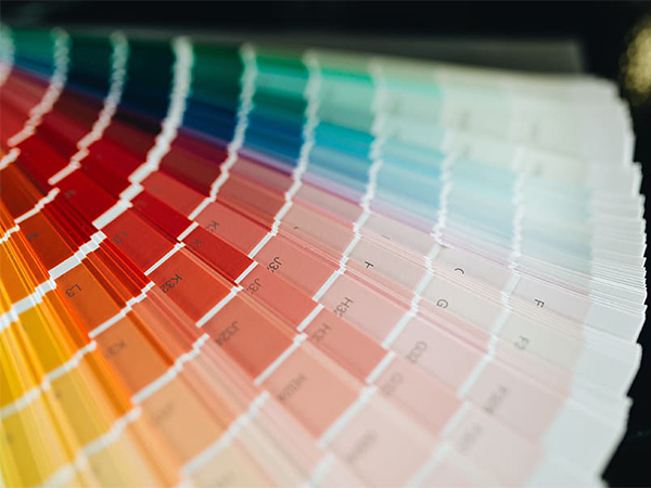
When it comes to interior design, color is one of the most powerful tools for shaping how a space looks, feels, and functions. The colors you choose can influence mood, perception, and even behavior, making them a key part of creating a comfortable and inspiring home environment.
A thoughtfully selected color palette can transform a room from plain and uninspiring into a space that feels balanced, welcoming, and reflective of your personality. Whether you're redecorating a single room or designing an entire home, understanding color psychology can help you make more intentional design choices.
The Psychology of Color in Interior Design
Colors communicate emotion without words. They can energize, calm, or even stimulate creativity depending on how they are used. This is why interior designers carefully consider color psychology when planning spaces.
Warm colors such as red, orange, and yellow often create feelings of energy, warmth, and excitement. Cool colors like blue, green, and purple tend to evoke calmness, relaxation, and clarity. Neutral tones such as white, beige, gray, and taupe provide balance and versatility.
Understanding these emotional responses helps you design spaces that support how you want to feel in each room.
Creating Balance with Color Palettes
A successful interior color scheme is about balance rather than dominance. Too many bold colors can overwhelm a space, while an overly neutral palette may feel flat or uninspired.
To create harmony in your home:
Energizing Spaces with Warm Colors
Warm colors are ideal for areas where activity, conversation, and social interaction take place. These tones can make spaces feel lively and inviting.
Best uses for warm colors include:
Creating Calm and Relaxing Spaces with Cool Colors
Cool colors are commonly used in spaces designed for rest. They help reduce stress levels and create a peaceful atmosphere.
Ideal spaces for cool tones include:
The Role of Neutral Colors in Modern Interiors
Neutral color palettes remain a cornerstone of modern interior design due to their flexibility and timeless appeal. They create a clean foundation that allows furniture, artwork, and décor to stand out.
Popular neutral shades include:
Personalizing Your Space Through Color
While color psychology offers helpful guidelines, personal preference should always play a major role in your design decisions. Your home should reflect your lifestyle, personality, and comfort preferences.
To personalize your space:
Lighting and Texture: Enhancing Your Color Palette
Modern interior design also considers how lighting and materials affect color perception. Natural and artificial lighting can dramatically change how colors appear throughout the day.
Color palettes play a powerful role in shaping the mood, comfort, and personality of your home. Whether you prefer bold, energetic spaces or soft, calming environments, understanding color psychology helps you design with intention.
By balancing warm, cool, and neutral tones—and considering lighting, texture, and personal preference—you can create a home that feels cohesive, functional, and uniquely yours. Thoughtful color choices not only enhance aesthetics but also support well-being and everyday comfort.
A thoughtfully selected color palette can transform a room from plain and uninspiring into a space that feels balanced, welcoming, and reflective of your personality. Whether you're redecorating a single room or designing an entire home, understanding color psychology can help you make more intentional design choices.
The Psychology of Color in Interior Design
Colors communicate emotion without words. They can energize, calm, or even stimulate creativity depending on how they are used. This is why interior designers carefully consider color psychology when planning spaces.
Warm colors such as red, orange, and yellow often create feelings of energy, warmth, and excitement. Cool colors like blue, green, and purple tend to evoke calmness, relaxation, and clarity. Neutral tones such as white, beige, gray, and taupe provide balance and versatility.
Understanding these emotional responses helps you design spaces that support how you want to feel in each room.
Creating Balance with Color Palettes
A successful interior color scheme is about balance rather than dominance. Too many bold colors can overwhelm a space, while an overly neutral palette may feel flat or uninspired.
To create harmony in your home:
- Choose a primary color and build around it
- Add complementary accent colors for contrast
- Use neutrals to ground the design
- Repeat colors in small details for cohesion
Energizing Spaces with Warm Colors
Warm colors are ideal for areas where activity, conversation, and social interaction take place. These tones can make spaces feel lively and inviting.
Best uses for warm colors include:
- Living rooms
- Dining areas
- Kitchens
- Home offices (for creativity and energy)
Creating Calm and Relaxing Spaces with Cool Colors
Cool colors are commonly used in spaces designed for rest. They help reduce stress levels and create a peaceful atmosphere.
Ideal spaces for cool tones include:
- Bedrooms
- Bathrooms
- Reading corners
- Meditation or wellness spaces
The Role of Neutral Colors in Modern Interiors
Neutral color palettes remain a cornerstone of modern interior design due to their flexibility and timeless appeal. They create a clean foundation that allows furniture, artwork, and décor to stand out.
Popular neutral shades include:
- White and off-white tones
- Beige and cream
- Light and charcoal gray
- Earthy taupe and sand tones
Personalizing Your Space Through Color
While color psychology offers helpful guidelines, personal preference should always play a major role in your design decisions. Your home should reflect your lifestyle, personality, and comfort preferences.
To personalize your space:
- Incorporate colors that make you feel comfortable and inspired
- Blend bold accents with softer base tones
- Use artwork, textiles, and décor to introduce color flexibility
- Adjust palettes based on room purpose and lighting
Lighting and Texture: Enhancing Your Color Palette
Modern interior design also considers how lighting and materials affect color perception. Natural and artificial lighting can dramatically change how colors appear throughout the day.
- Natural daylight enhances true color tones
- Warm lighting softens and enriches warm palettes
- Cool lighting sharpens blues and neutrals
- Textures like wood, fabric, and metal add depth to color schemes
Color palettes play a powerful role in shaping the mood, comfort, and personality of your home. Whether you prefer bold, energetic spaces or soft, calming environments, understanding color psychology helps you design with intention.
By balancing warm, cool, and neutral tones—and considering lighting, texture, and personal preference—you can create a home that feels cohesive, functional, and uniquely yours. Thoughtful color choices not only enhance aesthetics but also support well-being and everyday comfort.