
FEATURE ARTICLE
How to Use Color in Your Home: Simple Design Tips to Transform Any Space
Apr 22, 2026
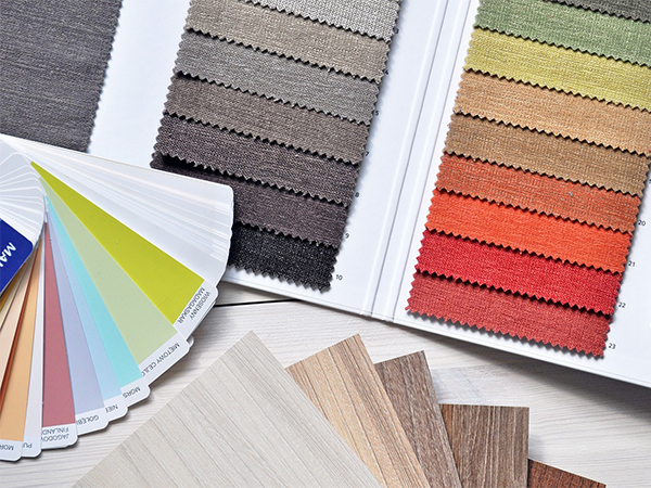
Color is one of the most powerful—and affordable—ways to transform your home. Whether you're refreshing a single room or updating your entire space, the right color choices can influence mood, enhance style, and create a more inviting environment.
With today’s design trends leaning toward personalization and comfort, understanding how to use color effectively is key. This guide covers modern, practical strategies to help you use color with confidence.
Start with a Neutral Foundation
A neutral base remains a timeless design strategy. Shades like white, beige, taupe, and soft gray create a clean, versatile backdrop that allows accent colors to stand out.
Updated Tip: Warmer neutrals (like creamy whites and greige tones) are trending, offering a cozier, more welcoming feel compared to cooler grays.
A neutral foundation also makes it easier to refresh your space seasonally without a full redesign.
Add Personality with Accent Walls (or Zones)
Accent walls are still effective—but modern design often favors accent zones rather than a single bold wall.
Consider:
Use Complementary Colors for Balance
Complementary colors—those opposite each other on the color wheel—create contrast and energy when used thoughtfully.
Examples include:
Choose Warm or Cool Tones Based on Mood
Color temperature plays a big role in how a space feels:
Create Depth with Layered Color
Layering different shades of the same color—also known as a monochromatic scheme—adds depth without overwhelming the space.
Try:
Use Color Psychology to Influence Mood
Color can subtly affect how you feel in a space. Thoughtful choices can improve both mood and productivity.
Incorporate Color Through Décor and Textures
You don’t need to repaint to make an impact. Color can be introduced through:
Don’t Forget Lighting Matters
Lighting significantly affects how colors appear in your home. Natural light, warm bulbs, and cool LED lighting can all change how a color looks throughout the day.
Tip: Test paint samples in different lighting conditions before committing to a final choice.
Using color effectively is about balance, intention, and personal style. By starting with a neutral base, layering tones, and thoughtfully adding accents, you can create a space that feels both stylish and comfortable.
Color isn’t just decorative—it’s transformative. With a few strategic updates, you can enhance your home’s mood, functionality, and overall appeal.
With today’s design trends leaning toward personalization and comfort, understanding how to use color effectively is key. This guide covers modern, practical strategies to help you use color with confidence.
Start with a Neutral Foundation
A neutral base remains a timeless design strategy. Shades like white, beige, taupe, and soft gray create a clean, versatile backdrop that allows accent colors to stand out.
Updated Tip: Warmer neutrals (like creamy whites and greige tones) are trending, offering a cozier, more welcoming feel compared to cooler grays.
A neutral foundation also makes it easier to refresh your space seasonally without a full redesign.
Add Personality with Accent Walls (or Zones)
Accent walls are still effective—but modern design often favors accent zones rather than a single bold wall.
Consider:
- Painting a reading nook or workspace
- Highlighting architectural features like fireplaces or built-ins
- Using color blocking for a contemporary look
Use Complementary Colors for Balance
Complementary colors—those opposite each other on the color wheel—create contrast and energy when used thoughtfully.
Examples include:
- Blue and orange
- Yellow and purple
- Green and red
Choose Warm or Cool Tones Based on Mood
Color temperature plays a big role in how a space feels:
- Warm tones (reds, oranges, yellows): Energizing and inviting—great for living rooms and kitchens
- Cool tones (blues, greens, purples): Calming and relaxing—ideal for bedrooms, bathrooms, and home offices
Create Depth with Layered Color
Layering different shades of the same color—also known as a monochromatic scheme—adds depth without overwhelming the space.
Try:
- Mixing light, medium, and dark tones of one color
- Incorporating texture through fabrics, rugs, and décor
- Using subtle contrast to keep the look dynamic
Use Color Psychology to Influence Mood
Color can subtly affect how you feel in a space. Thoughtful choices can improve both mood and productivity.
- Blue/Green: Calm, focus, relaxation
- Yellow: Energy, optimism, creativity
- Red: Passion, warmth, stimulation (best used sparingly)
Incorporate Color Through Décor and Textures
You don’t need to repaint to make an impact. Color can be introduced through:
- Throw pillows and blankets
- Rugs and curtains
- Artwork and wall décor
- Furniture accents
Don’t Forget Lighting Matters
Lighting significantly affects how colors appear in your home. Natural light, warm bulbs, and cool LED lighting can all change how a color looks throughout the day.
Tip: Test paint samples in different lighting conditions before committing to a final choice.
Using color effectively is about balance, intention, and personal style. By starting with a neutral base, layering tones, and thoughtfully adding accents, you can create a space that feels both stylish and comfortable.
Color isn’t just decorative—it’s transformative. With a few strategic updates, you can enhance your home’s mood, functionality, and overall appeal.