
FEATURE ARTICLE
Why a Responsive Website Is Essential for Modern Online Success
Dec 31, 2025
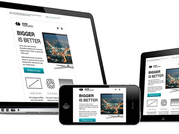
In today’s fast-paced digital world, the internet is deeply woven into everyday life. From shopping and banking to social media and entertainment, most online interactions now take place on mobile devices. As user behavior continues to shift toward smartphones and tablets, having a responsive website is no longer a luxury—it’s a necessity for businesses and individuals who want to remain competitive online.
A responsive website ensures your online presence works seamlessly for every visitor, regardless of how they access your site. Let’s explore what responsive design means and why it plays a critical role in your digital success.
What Is a Responsive Website?
A responsive website automatically adapts its layout, images, and functionality to fit any screen size. Whether visitors access your site on a desktop, laptop, tablet, or smartphone, they receive a consistent, user-friendly experience. This flexibility is achieved through fluid grids, scalable images, and CSS media queries that adjust content based on screen dimensions and device capabilities.
The Mobile Revolution: Why Mobile Matters
Mobile devices have transformed how users access information. Today, people expect fast load times, easy navigation, and readable content on smaller screens. Whether researching a product, scheduling an appointment, or browsing services, users quickly leave sites that are difficult to use on mobile. A responsive website meets these expectations and keeps visitors engaged.
Key Reasons Your Website Must Be Responsive
A responsive website ensures your online presence works seamlessly for every visitor, regardless of how they access your site. Let’s explore what responsive design means and why it plays a critical role in your digital success.
What Is a Responsive Website?
A responsive website automatically adapts its layout, images, and functionality to fit any screen size. Whether visitors access your site on a desktop, laptop, tablet, or smartphone, they receive a consistent, user-friendly experience. This flexibility is achieved through fluid grids, scalable images, and CSS media queries that adjust content based on screen dimensions and device capabilities.
The Mobile Revolution: Why Mobile Matters
Mobile devices have transformed how users access information. Today, people expect fast load times, easy navigation, and readable content on smaller screens. Whether researching a product, scheduling an appointment, or browsing services, users quickly leave sites that are difficult to use on mobile. A responsive website meets these expectations and keeps visitors engaged.
Key Reasons Your Website Must Be Responsive
-
Enhanced User Experience
User experience is at the heart of every successful website. Responsive design makes navigation intuitive, text easy to read, and buttons simple to tap. When users enjoy a smooth experience, they stay longer, engage more, and are more likely to convert into customers. -
Mobile-First Indexing and SEO Benefits
Search engines—most notably Google—use mobile-first indexing, meaning your site’s mobile version plays a significant role in search rankings. A responsive website supports stronger SEO performance, improves visibility, and helps your business reach more potential customers. -
Cost-Effective Website Management
Maintaining separate desktop and mobile sites is costly and time-consuming. Responsive design eliminates this need by allowing you to manage one website that works across all devices, reducing development, updates, and long-term maintenance costs. -
Accessibility and Inclusivity
A responsive website improves accessibility for users who rely on assistive technologies or alternative input methods. Creating an inclusive digital experience expands your audience, supports compliance with accessibility standards, and reflects positively on your brand. -
Improved Loading Speed
Mobile users expect fast results. Responsive websites are optimized to load efficiently on smaller devices, helping reduce bounce rates and prevent visitors from leaving due to slow performance. -
Stronger Social Media Performance
Much of today’s website traffic comes from social media, primarily via mobile devices. A responsive site ensures users who click through from social platforms enjoy a seamless experience, increasing engagement and conversions.
-
Adopt a Mobile-First Strategy
Design with mobile users first, then scale up for larger screens. This approach ensures clarity, speed, and usability across all devices. -
Use Fluid Layouts and Flexible Images
Relative sizing allows content to adapt smoothly to different screen sizes without distortion or awkward spacing. -
Optimize for Touch Navigation
Ensure buttons, menus, and links are easy to tap, with precise spacing and an intuitive touchscreen design. -
Test Across Devices and Browser
Regular testing helps maintain consistent performance and appearance, preventing usability issues before they impact visitors. -
Prioritize Key Content
Highlight the most crucial information for mobile users so they can quickly find what they need without excessive scrolling.